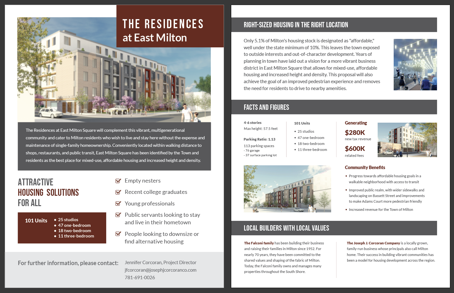
In this project, I had the privilege of crafting a compelling two-page document aimed at presenting the features, facts, and figures of a proposed real estate development. The objective was to create an informative and visually engaging document that effectively showcased the potential of the development and its benefits to the community. The final document not only conveyed essential information but also captured the essence of the project's possibilities through strategic design choices.
Audience
The two-page document was tailored for the City Planning Commission, a discerning audience with a vested interest in understanding the key details and merits of the proposed real estate development. It was imperative to present the information in a concise yet impactful manner.
My Role
As the creative driver of the project, my role encompassed a range of responsibilities that collectively contributed to the creation of a captivating proposal document:
Content Analysis: I meticulously reviewed the client-provided text document, extracting crucial information about the real estate development's features, benefits, and statistics. This step was vital to ensure accuracy and a comprehensive understanding of the project.
Visual Strategy: I developed a strategic visual approach based on reference images of the proposed building's structure and color scheme. The theme, including color palette, fonts, and layout treatment, was crafted to reflect the development's essence and appeal.
Design Direction: Building on the visual strategy, I established a design direction that balanced text and imagery, ensuring that both elements worked in harmony to convey the project's potential. The goal was to create a well-structured and visually pleasing composition.
Layout and Hierarchy: The challenge of integrating a significant amount of text along images was met by carefully structuring the layout. I employed a hierarchy that guided the viewer's eye through the document, creating clear associations between text and supporting visuals.
Typography and Color Palette: The chosen fonts and color palette not only aligned with the development's aesthetics but also ensured legibility and visual consistency, fostering a cohesive reading experience.
Balancing Elements: One of the core challenges was achieving a balanced composition where text and images complemented each other without overwhelming the viewer. This involved thoughtful placement and sizing of visual and textual components.
Conclusion
This project exemplifies my ability to translate intricate concepts into an informative and visually compelling format. By employing strategic design choices, a tailored color palette, and a structured layout, I successfully produced a proposal document that conveyed the possibilities of the real estate development to the City Planning Commission. The challenge of balancing textual content with imagery was met with careful consideration, resulting in a harmonious presentation. Through my role in this project, I showcased my proficiency in creating impactful visual communication tools that effectively convey complex information and captivate the audience's attention.